Forgewright Performance
FeaturedConcept design for a coach-led strength gym — neon-on-black brutalism, class schedule that does not lie, and a membership grid that earns its prices.
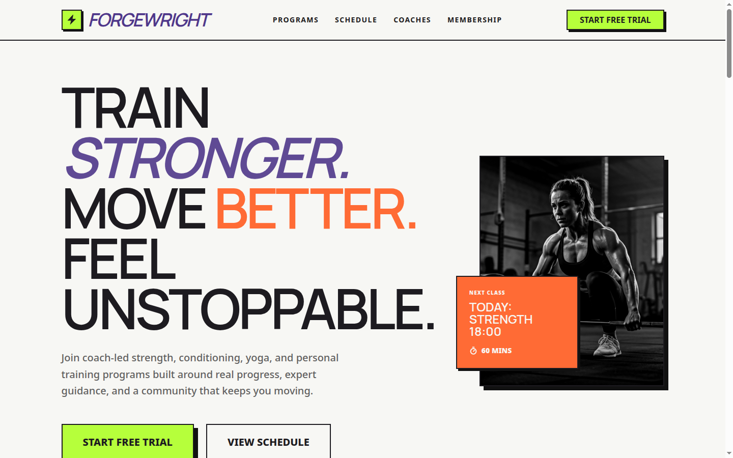
Forgewright Performance — Train Stronger. Move Better.
A concept design exploring how a coach-led strength gym should sell membership online
This is a portfolio concept piece, not a live client engagement. We designed Forgewright to challenge a tired assumption in the niche: that fitness sites have to look "premium" or "soft." The serious lifting gyms we benchmarked don't — they look like a workshop. We pushed that further into a brutalist, neon-on-black system with hard borders, lime drop-shadows, and zero stock-photo gloss.
What the design solves
In this segment, the customer's first question is "is this gym for me, or is it for influencers?" — and the second is "do I have to commit before I see a class schedule?" Most gym sites answer wrong on both. Forgewright's mockup answers the first by leaning hard into a coaching aesthetic — bold display caps, real coach photography, no curated mirror selfies. It answers the second by putting the next class card directly in the hero with a live timer, so visitors can see — without scrolling — that this is a working schedule, not a marketing prop.
The Programs grid uses category color blocks (Strength, Conditioning, Yoga, Personal) with neon-lime accent shadows. Each program card includes coach name, time slots, and intensity level — the three facts a serious lifter actually wants. The Membership tier table is built around a simple promise: no annual contracts, no enrollment fees, cancel from your dashboard. That copy lives next to the price, not buried in fine print.
A coaches block uses real headshots and short, candid bios — "Marek competed at masters level. He's slower than he used to be and he'll tell you so." — rather than glossy credentials. The honesty is the brand.
Note
Design system highlights
- Brutalist border + drop-shadow system: 3px black borders with 4px lime offset shadows on every interactive surface
- Display italic caps for the brand mark; condensed sans-serif for body — visually unmistakable from any "boutique studio"
- Live next-class timer card anchored to the hero, counting down to the next session start
- Color-coded program categories so a returning visitor can scan straight to "Strength" without reading
- Grayscale + contrast-boosted hero photography to keep the focus on type and form
Stack
- TanStack Start with React 19 for SSR
- Tailwind v4
@themetokens with custom shadow utilities for the brutalist system - Framer Motion for hover state choreography on tier cards
- Deployed on Vercel
Want this for your gym?
The entire system — navbar with class timer, hero, programs grid, schedule table, coaches block, membership tiers, contact — is built and rebrandable. We can adapt the type, swap colors out of neon if your brand calls for something different, wire in your gym management software, and ship the production site in around two weeks. Start a conversation →
On This Page