Sterling & Associates
Concept design for a boutique family law practice — confidentiality-first hero, anonymized case studies, and a client journey that respects how heavy these conversations are.
Sterling & Associates — Boutique legal counsel that respects the weight of the conversation
A concept design exploring how a boutique family-law practice should appear online
This is a portfolio concept piece, not a live client engagement. The brief we wrote ourselves: "design a website where someone reading at 11pm during a difficult week feels like they could pick up the phone tomorrow." That single user picture drove every decision in the page.
What the design solves
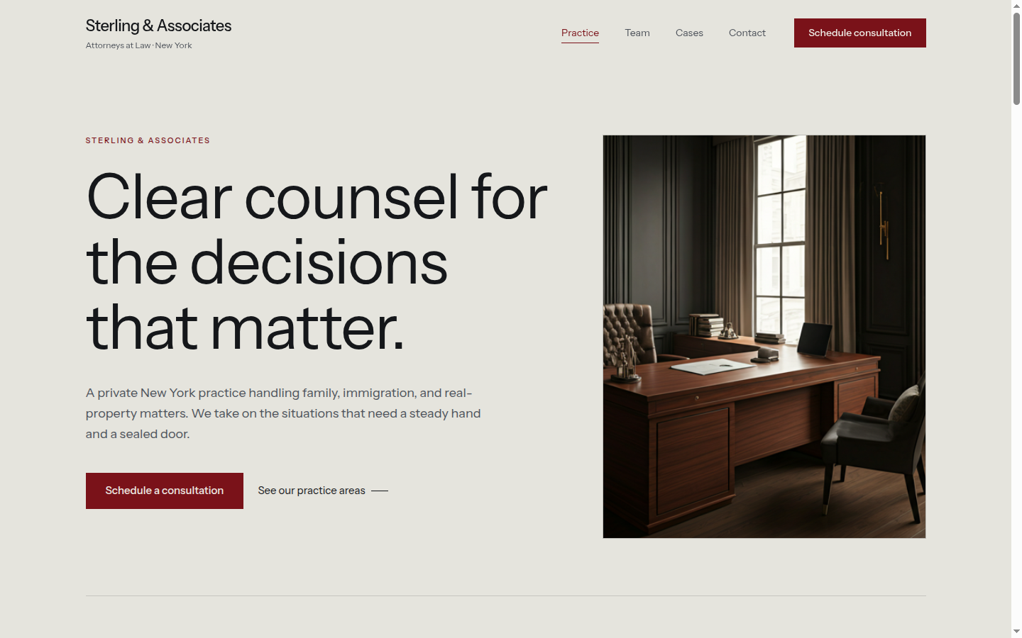
Most law firm sites in this segment look identical: a courthouse hero, a stock-photo handshake, and four practice areas in a grid. None of those choices respect how heavy the conversation actually is for the person on the other side. Sterling's mockup leads instead with a confidentiality cue — a small lock icon, a "Confidential consultation" label, and a calm guardrail divider — before any service is mentioned. The hero photograph is desaturated to 20% so the type carries the weight, and the headline avoids legal posturing in favor of measured plain language.
A Practice Areas section moves through the firm's actual specialties (family, estates, employment) with short, candid descriptions of what each engagement looks like — including the parts most firms hide ("most matters resolve outside of court — we'll tell you upfront when yours likely won't"). This is the credibility the audience is actually looking for.
The case-studies block uses anonymized engagements ("a separation involving a closely-held business") with outcomes phrased as relief, not victory. The client journey is broken into four explicit steps, each with a duration estimate, so a reader can see what the next ninety days might feel like. A confidential intake form sits at the bottom — short, no marketing checkboxes, no "How did you hear about us?"
Note
Design system highlights
- Confidentiality cues woven into the hero — lock icon, "Confidential consultation" label, calm divider — before any sell
- Editorial serif headlines with generous tracking; refined sans-serif body — visually distinct from the standard courthouse template
- Desaturated hero photography so the type carries the weight, not the image
- Anonymized case studies as the primary social proof — tone-appropriate for the audience
- Confidential intake form with no marketing fields — calibrated for the moment a reader is actually ready to reach out
Stack
- TanStack Start with React 19 for SSR and routing
- Tailwind v4
@themetokens for per-practice color scoping if a firm runs multiple verticals - Framer Motion for restrained hero stagger (no scroll-jacking — wrong audience)
- Deployed on Vercel
Want this for your firm?
The whole system — navbar, hero, practice areas, case studies, client journey, journal, intake — is rebrandable in an afternoon. We can adapt typography to match your firm's existing letterhead, integrate your case-management or intake software, and ship the production site in around two weeks. Start a conversation →
On This Page