Solène Editorial Photography
FeaturedConcept design for an editorial wedding and portrait photographer — overlapping image grid, serif italic voice, and a portfolio that loads as fast as it feels.
Solène Editorial Photography — Photography that feels like memory
A concept design exploring how a wedding and portrait photographer should present a body of work online
This is a portfolio concept piece, not a live client engagement. We designed Solène to push back against the dominant pattern in the niche: full-bleed sliding hero with autoplaying images and a hamburger menu hiding everything else. Those sites are slow, hostile to mobile, and erase the photographer's voice. We went the other way — editorial layout, serif italic typography, a stacked image grid, and prices visible without a "request a quote" form.
What the design solves
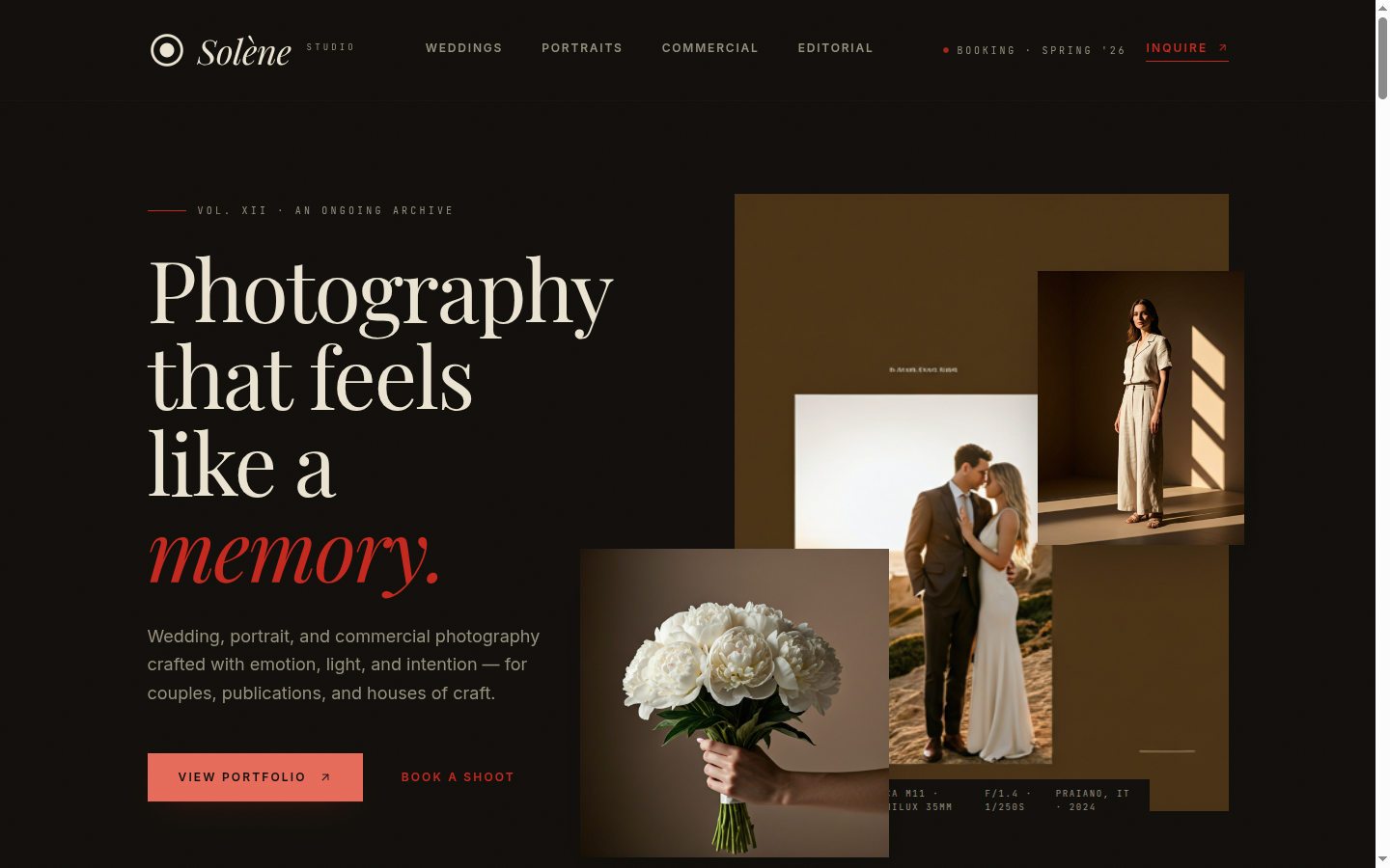
A wedding photographer's website has one job: convince a couple in the first three seconds that this person sees beautifully. Most sites in the niche bury that with menus and modals. Solène's mockup leads with three overlapping hero images at staggered scales — a main editorial frame, a tight detail, and an environmental third — so a visitor sees range without scrolling. The brand is set in serif italic at restrained scale; it never competes with the photography.
A Services section breaks down the offer (Wedding stories, Portrait sessions, Brand campaigns) with short, candid descriptions and starting prices. Each service has a clearly named deliverable ("a printed lay-flat album, hand-bound, mailed within 90 days") instead of vague packages. An Experience block walks through the four-step working process (Discovery call → Moodboard → Shoot day → Private gallery) — short enough to read in one breath, detailed enough that a couple knows what to expect.
The portfolio block uses a curated nine-image grid with subtle borders, optimized as AVIF for fast load — important because most photography sites lose visitors during the second-image preload.
Note
Design system highlights
- Overlapping hero image grid at staggered scales — editorial breadth without a slider
- Serif italic brand mark at restrained scale; minimal sans-serif body so type never competes with imagery
- Tertiary token underline borders on nav links — quietly different from the standard underline
- Image optimization built-in via @unpic/react with AVIF and srcset, so portfolio loads stay sub-second
- Bordered image stacks in section blocks — referencing print and album layout rather than web-app cards
Stack
- TanStack Start with React 19 for SSR and per-image streaming
- @unpic/react for responsive AVIF/WebP image delivery
- Tailwind v4
@themetokens for restrained color scoping - Framer Motion for hero stagger
- Deployed on Vercel with edge image optimization
Want this for your photography studio?
The whole layout — navbar, overlapping hero, services, experience timeline, portfolio grid, testimonials, inquiry form — is rebrandable. We swap in your imagery, set your starting prices, wire up your booking or inquiry flow, and ship the production site in around two weeks. Start a conversation →
On This Page