LuxeDental — Boutique Dental Care
FeaturedConcept design for a heritage-building dental clinic — calm typography, transparent pricing, and a hospitality-led tone that turns a feared appointment into a welcomed one.
LuxeDental — A clinic that feels less like a clinic
A concept design exploring how a boutique dental practice should welcome anxious patients online
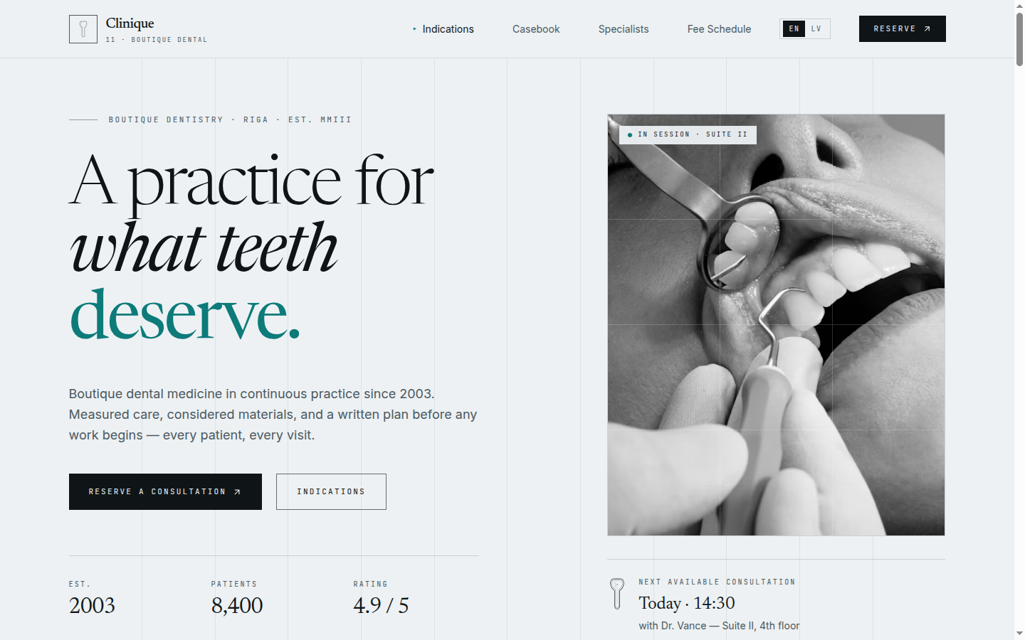
This is a portfolio concept piece, not a live client engagement. We designed LuxeDental to test a single idea: if you strip out every "stock dentist" cliché — gloved hand on a mirror, smiling family stock photo, "Book Now" cherry-red button — what's left to reassure a nervous patient? The answer, we think, is hospitality language and editorial calm.
What the design solves
Most dental sites in this segment optimize for SEO at the expense of tone. They lead with "implants from €X" before they've even said hello. LuxeDental flips that order: a quiet serif headline, a hospitality-grade subhead, and a single floating quote card — "A steady chair." — that sets the emotional contract before the patient ever sees a price.
The treatments are still there, of course. They sit one scroll below the fold, in a structured grid with transparent starting prices and short, plain-language descriptions ("a quiet check-in, a thirty-minute exam, a clear plan — no upsell"). Pricing is paired with a "what's included" line so patients know what they're buying.
A bilingual EN/LV toggle lives in the navbar — a small detail, but one that quietly signals this clinic is set up for international patients (a meaningful share of the Riga and Jūrmala dental market). Below the treatments, a team section uses real headshots and short bios written in the same hospitality voice — "Anna takes the longest appointments because she doesn't believe in rushing crowns," — instead of the standard "Dr. X graduated from Y in 2014" CV.
Note
Design system highlights
- Serif display for the brand and hero headline; cool, neutral sans-serif for body — explicit visual reference to luxury hospitality, not medical
- Cool boutique blue primary, used sparingly — large neutral surfaces let typography do the work
- Floating quote card with serif italic accent, anchored to the hero image
- EN/LV locale toggle wired into the design system so every section ships bilingual
- Generous whitespace through the treatments grid — prices are visible but never crowded
Stack
- TanStack Start with React 19 for SSR and i18n routing
- Tailwind v4
@themetokens scoped per mockup - Framer Motion for subtle hero stagger (no scroll-jacking — dental patients hate sudden movement)
- Deployed on Vercel
Want this for your dental clinic?
The whole component library — navbar, hero, treatments grid, team block, testimonials, booking form, contact map — is built and themeable. We can adapt it to your clinic, plug in your booking software (or build one), and ship a production bilingual site in around two to three weeks. Start a conversation →
On This Page