Steward & Pet Veterinary
FeaturedConcept design for a modern veterinary clinic — gradient-text hero, glass-card status indicator, and a calm Emergency band that gives anxious owners a number, not a form.
Steward & Pet — Trusted, calm, modern veterinary care
A concept design exploring how a veterinary clinic should support anxious owners online
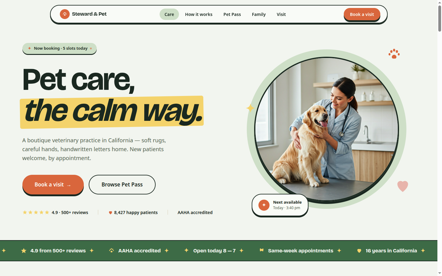
This is a portfolio concept piece, not a live client engagement. We designed Steward & Pet around a single user picture: an owner whose dog is acting strangely at 9pm, looking for a clinic that feels grown-up and calm enough to call. Every layout decision answers that user.
What the design solves
Most vet sites in the niche optimize for boarding sales and "puppy package" upsells before they earn the trust of an anxious caller. Steward's mockup leads with a gradient-text hero headline and a glass-card status indicator — "Walk-in slots open" — that quietly tells a worried owner they don't have to wait for a callback. A red emergency button with a pulsing dot anchors the navbar, available from every section.
The Services block names what owners actually want to know — wellness exams, vaccinations, dental, surgery, exotic and equine — in plain language with starting prices, not "contact for quote." A team block uses real photographs and short bios that include the species each vet specializes in (cats, exotics, large dogs) — the kind of granular detail an anxious owner is actually looking for.
The standout section is Emergency. Most vet sites either bury the after-hours number under a contact form or paint a panic-red banner that makes the page feel like a hospital. Steward uses a calm warm-cream background with targeted red accents only on the call buttons — calm enough not to spike a worried owner's pulse, clear enough that the number is unmissable. The wellness-plans block is structured like a subscription tier table, with itemized inclusions (vaccines, two annual exams, dental cleaning, etc.) so owners can compare at a glance.
Note
Design system highlights
- Gradient-text hero headline (primary → secondary) — distinctive without being corporate
- Glass-card walk-in status indicator with frosted background and subtle live pulse
- Animated pulse blur orbs in the hero background — soft visual movement that reads as warmth, not panic
- Calm Emergency band — warm cream surface with targeted red accents only on the call CTAs (not the whole section), so the page never feels alarming
- Wellness plan tier table with itemized inclusions for at-a-glance comparison
Stack
- TanStack Start with React 19 for SSR
- Tailwind v4
@themetokens for cool primary + warm cream Emergency band scoping - Framer Motion with motion.button hover/tap on the gradient CTA — single small flourish, calibrated for the audience
- Deployed on Vercel
Want this for your veterinary clinic?
The whole system — navbar with always-visible emergency CTA, gradient hero, services, team, calm Emergency band, wellness plans, contact — is rebrandable. We adapt typography to your clinic, integrate with your practice management software (ezyVet, AVImark, Provet, or custom), and ship the production site in around two to three weeks. Start a conversation →
On This Page